Ostra Paper Goods
Brand identity
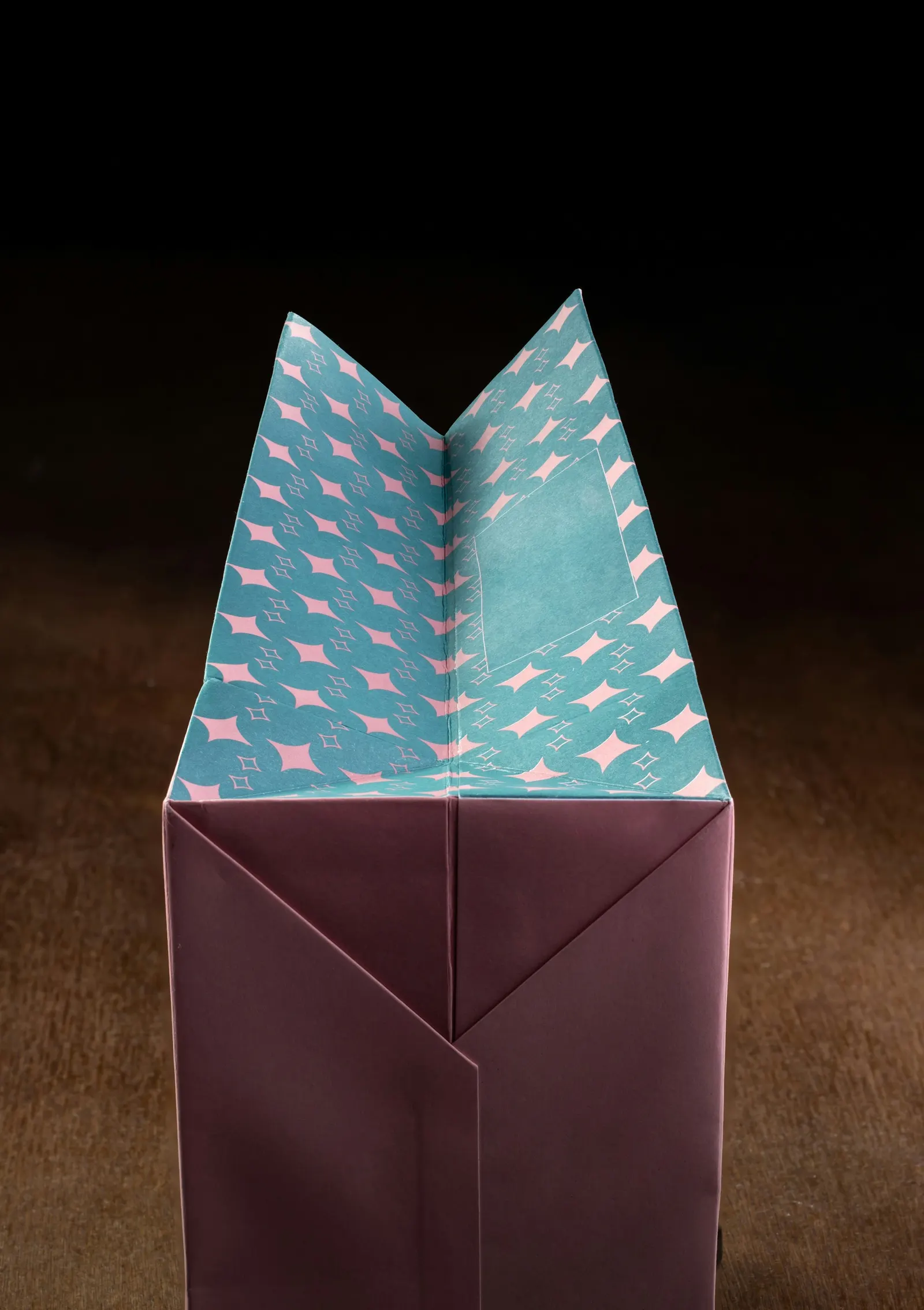
A new identity and folding packaging system for a small stationery maker, built from one star pattern and two colours.
Ostra Paper Co.
Copenhagen
Brand identity, Packaging, Art direction
The brief
Ostra had grown from one market stall to 40 stockists, and every shop displayed them differently. They needed packaging that looked the same on any shelf and cost less to make.
What we did
We drew one star pattern that tiles at any size and paired it with two colours, teal and blush. Every box now folds from a single flat sheet with no glue, and the bags reuse the same print.
The result
Packaging cost per order fell by 22 percent, and Ostra now ships flat stock to every stockist.